“Small is beautiful”, as economist Ernst Friedrich Schumacher points out: this Milanese apartment is tangible proof. In this 30 square meter space, every corner has been optimized, with architects and designers Anna Foresio and Pietro Carlino making the most of every square centimeter. “The owner, a young woman of 27, asked us to optimize the spaces as much as possible by retaining the parquet flooring in the bedroom and the position of the bathroom,” explain the architects. Originally, this small space opens onto a dark entrance with an imposing wardrobe, and onto a narrow corridor leading to the bathroom, kitchen and bedroom. “The challenge was to illuminate everything,” continues the duo, who chose to reduce the space of the bathroom in order to bring light to the entrance via a curved wall.
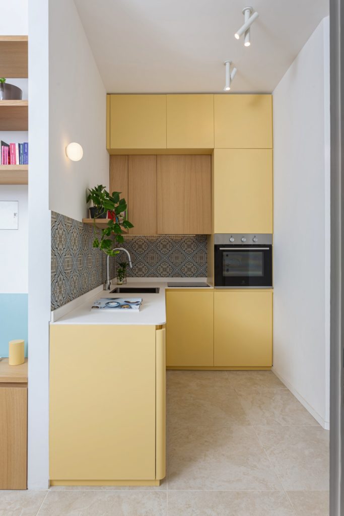
Anna Foresio and Pietro Carlino have also fitted out a kitchenette which, although small, is equipped with everything necessary. It is connected to the bedroom-living room furnished with a table and a small sofa bed. The pre-existing wooden floor was also “cleaned and sanded to look completely new,” the duo continues.
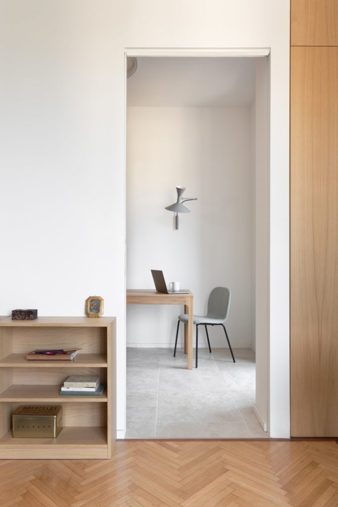
“A large sliding opening was also installed between the living room and the bedroom to allow natural light to flood all the spaces and to create beautiful continuity between the entrance and the bedroom window,” add Anna Foresio and Pietro Carlino. In the bathroom, the shower is also moved close to the window. A small niche has been placed not far away to store everyday objects.
“Overall, we wanted to bring color, particularly in terms of storage,” indicate the architects and designers in charge of the project. They were the ones who installed almost all of the furniture on site. Wood is for this reason a leitmotif in the apartment: we find it on the custom-made furniture, as for the shelves, the base cabinet in the living room and those in the bathroom.
Apart from the parquet, the floor of the apartment is covered with light gray sandstone. As for the kitchen, it was colored yellow to bring brightness. “We combined this shade with decorative tiles with geometric patterns using colors that can be found almost everywhere on site,” conclude Anna Foresio and Pietro Carlino of Fo.Ca Studio.
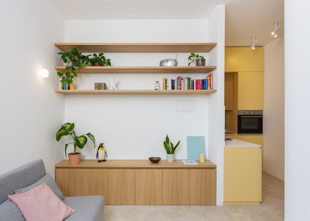
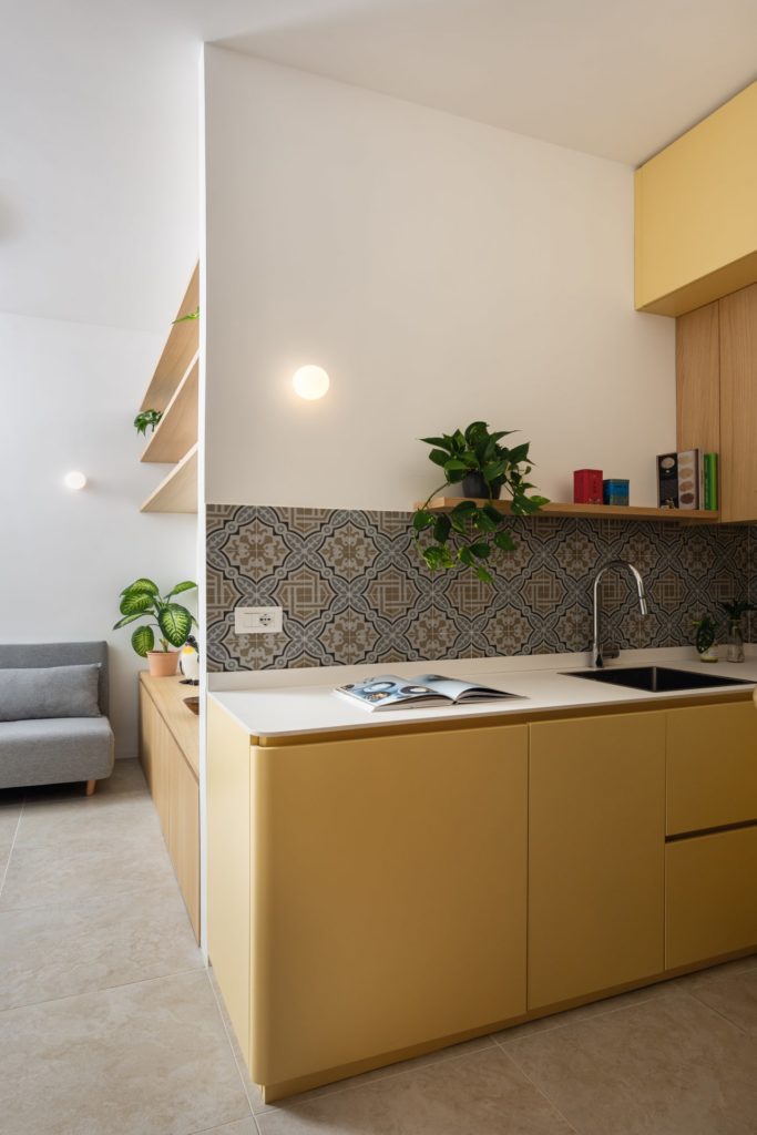
Although small, the kitchenette contains everything you need and communicates perfectly with the living space.
The kitchen is originally the darkest room in the apartment. The yellow of the furniture helps illuminate the space. “We combined decorative tiles with geometric patterns using colors that can be found almost everywhere on site,” explains the duo from Fo.Ca Studio.
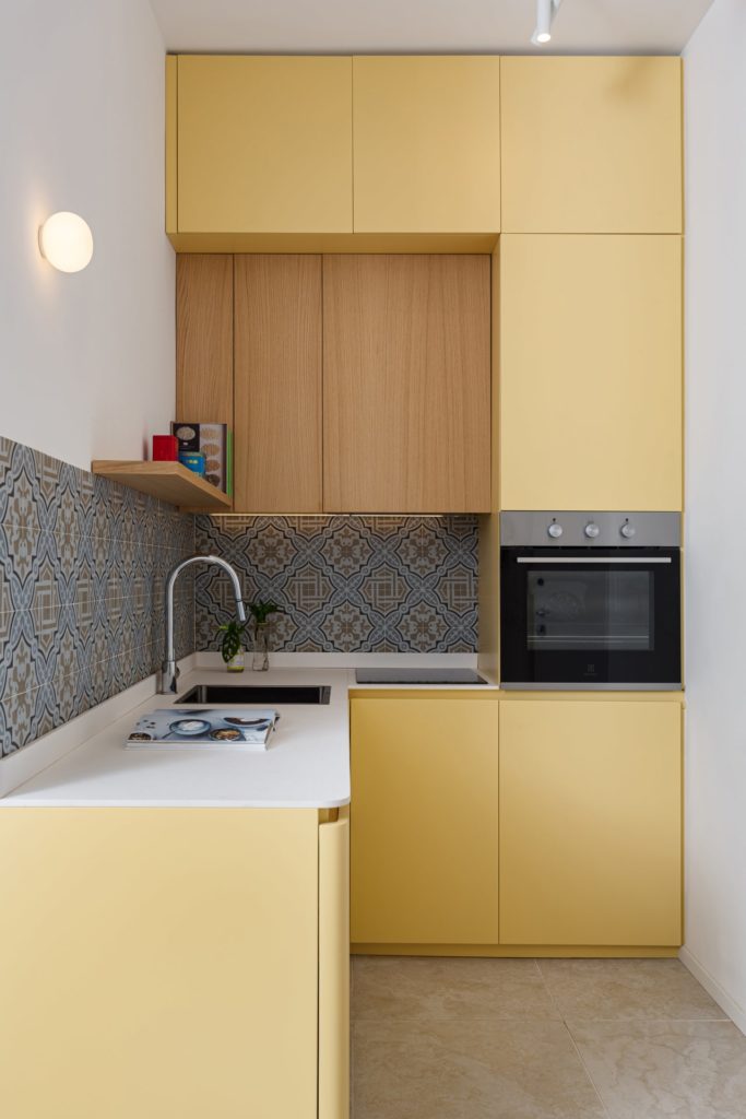
The kitchenette is directly connected to the living space which is furnished with a table and a small sofa bed.
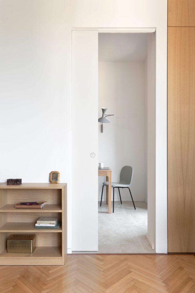
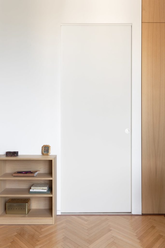
“A large sliding door was installed between the living room and the bedroom to allow natural light to flood all the spaces, but also to create a beautiful continuity between the entrance and the bedroom window,” explain Anna Foresio and Pietro Carlino.
The light wood of the parquet floor is a leitmotif in the apartment: it is found on custom-made furniture, such as the shelves, the low cabinet in the living room and those in the bathroom.
A small bookcase/bedside table and a niche, also in oak, complete the layout of the living room.
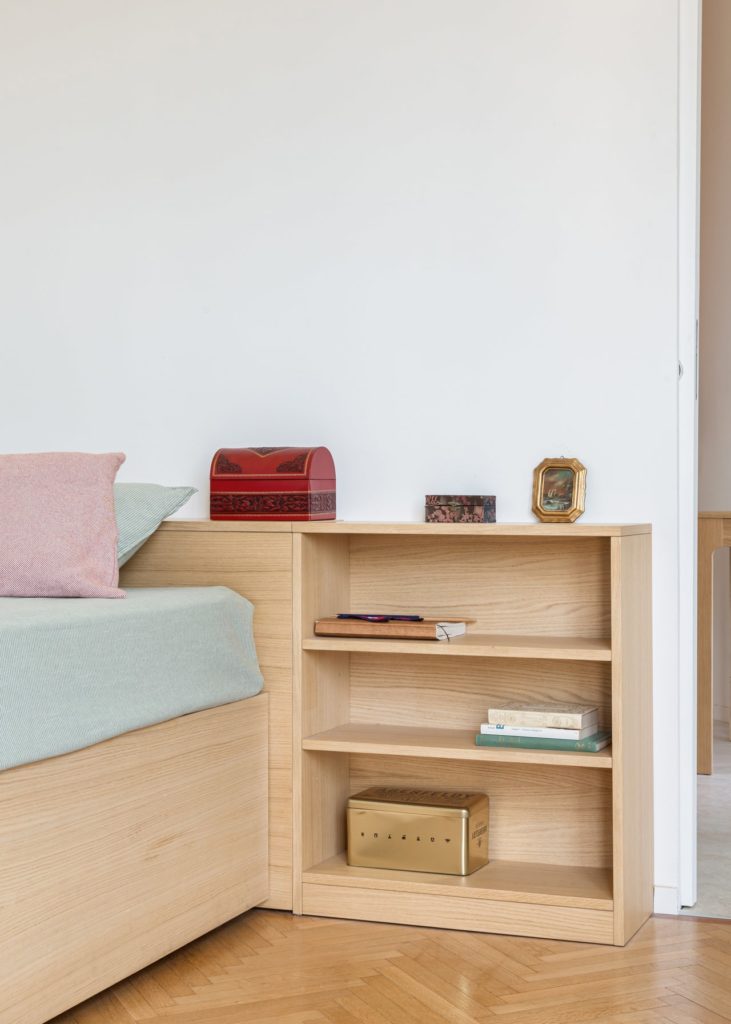
“We made almost all the furniture in the bedroom, including a large oak bed with storage on the sides and under the slats,” say Anna Foresio and Pietro Carlino.
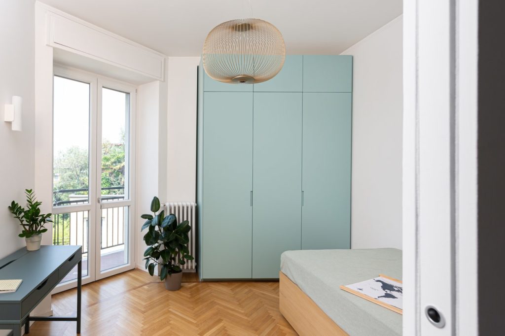
A light blue wall cabinet brings a colorful touch and energizes the room.
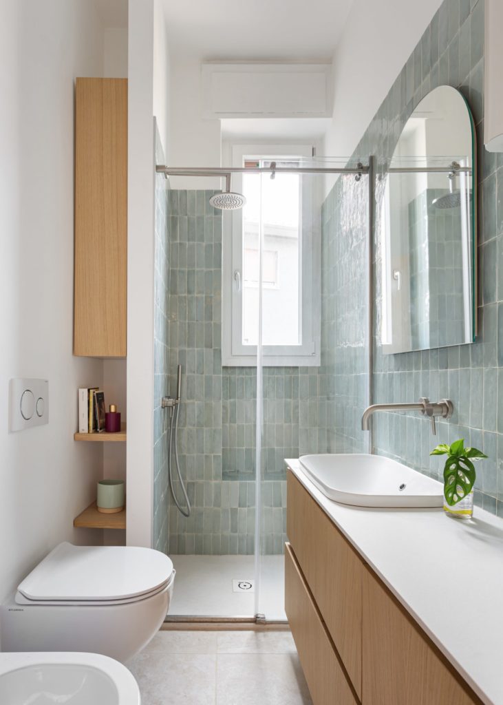
The bathroom has been completely redesigned. The shower was moved near the window, next to a storage area.
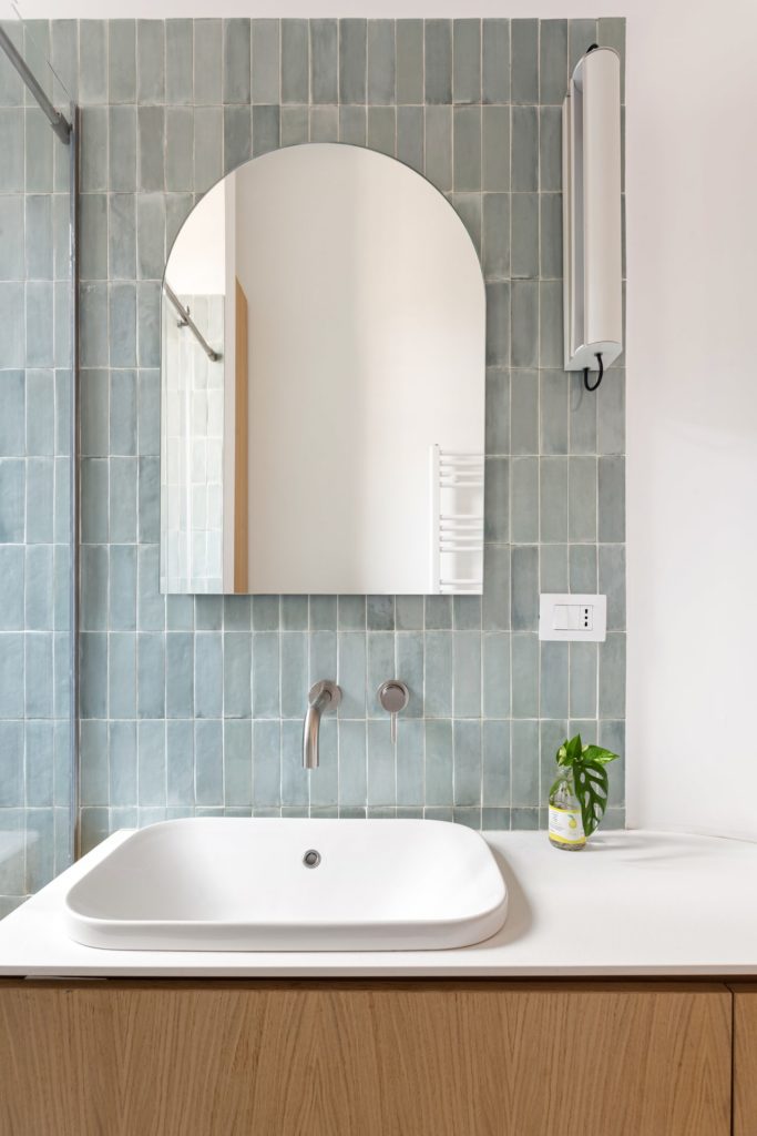
“We opted for shiny rectangular tiles in a light blue-green color,” conclude Anna Foresio and Pietro Carlino of Fo.Ca Studio.
