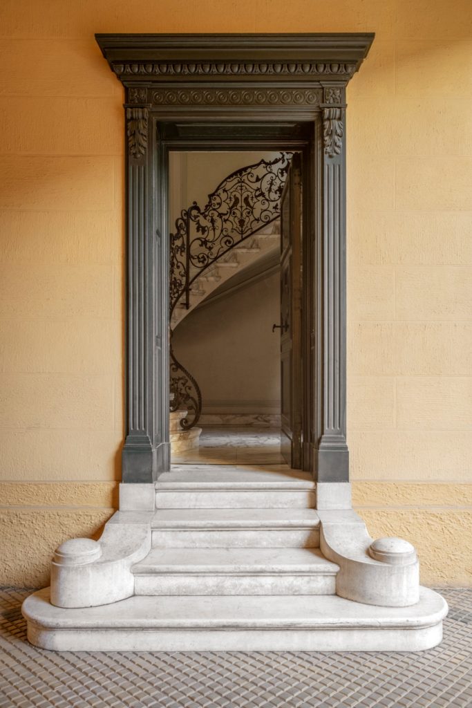
In an Art Nouveau building in the Lombard capital, architect Giuseppina Motta and furniture designer Claudio Spotti open the doors of their apartment to us. An oasis in the heart of the city where we glimpse the past, present and future of design. The apartment where Giuseppina Motta lives makes an impression from the staircase that leads to its door. “The first time I invited Claudio, he took the wrong entrance and took the other flight of stairs: I saw him coming through the back entrance! Too bad, because I relied a lot on the visual impact of the main entrance,” she remembers with a smile.
All with a disconcerting modesty, because at the top of these steps a dreamlike world awaits us. Take a designer and a furniture publisher, give them an Art Nouveau house in the heart of old Milan, place it all in the middle of Design Week and you get this enchanting place. This is what happened at the last Fuorisalone: Giuseppina Motta, architect and designer, and Claudio Spotti – heir with his brother Mauro to the family furniture business which he successfully transformed thanks to the Spotti multi-brand showroom and SEM editions – have decided to open the doors of their house, furnished with new and old SEM collections.
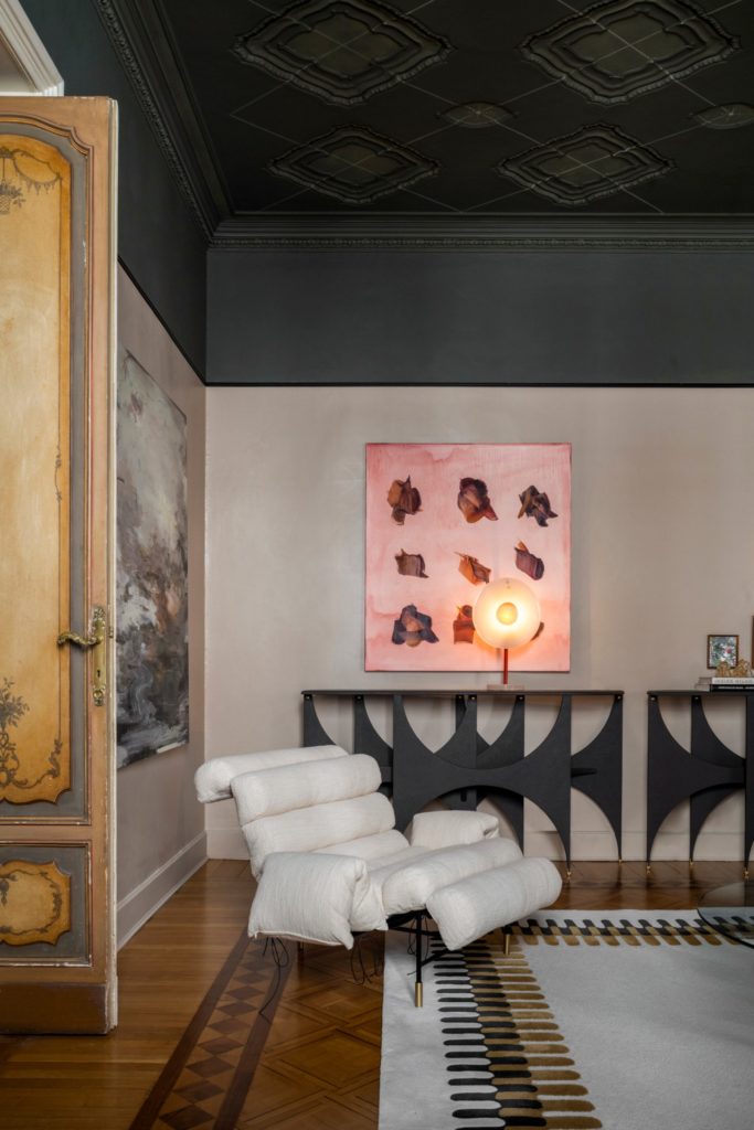
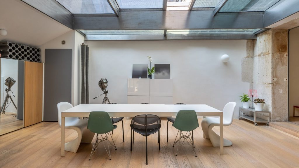
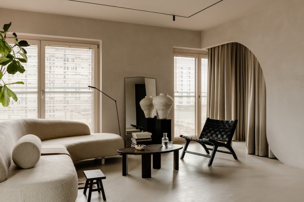
The historical envelope combined with contemporary pieces from numerous creators rewrite their respective journeys together, to weave a beautiful story. Claudio Spotti brought furniture and objects that he had designed over the years by Zaven, Giacomo Moor, Hannes Peer, Valentina Cameranesi Sgroi, Maya Leroy, the Marcante-Testa duo, Elisa Ossino, Vormen… and Giuseppina Motta herself -even. It is the latter who orchestrates the whole, chooses the colors and locations of these elements; it’s up to her to furnish and design, and she knows this house well where she originally lived alone.
“I moved here six years ago. The building dates from the early 1900s and was built by the owner of the premises. The apartment has a beautiful independent staircase and it initially occupied a surface area probably larger than today. When I arrived, it was all white with a gray ceiling and the living room was divided into two rooms, because the house previously housed the offices of a fashion house. »
Giuseppina Motta gradually returned the spaces to their original proportions, preserved the decorated doors and the old window frames, deliberately dilapidated, kept the stuccoes and frescoes of the central core on the ceilings, while often changing the colors of the entrance. In the kitchen, when you look up, Latin inscriptions are legible on the ceiling. On the floor, parquet or red cement gravel. And in the bathroom, redone more recently, Giuseppina Motta left the beautiful decorative tiles and ceramics intact and only intervened in the shower area in order to replace a fake marble with a real one, a Verona red.
She then designed the kitchen and some custom furniture, including a large built-in cupboard in the living room with panels with geometric patterns obtained by working on the stucco, sometimes waxed and sometimes scratched, “because the house lacks storage despite its 170 square meters,” explains Motta.

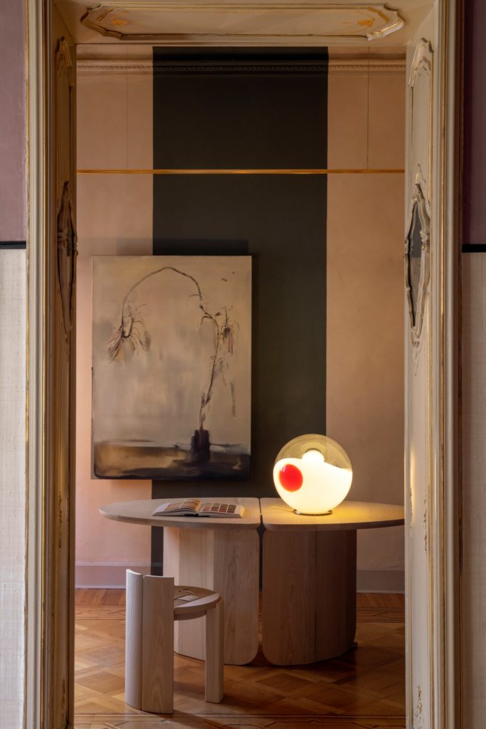
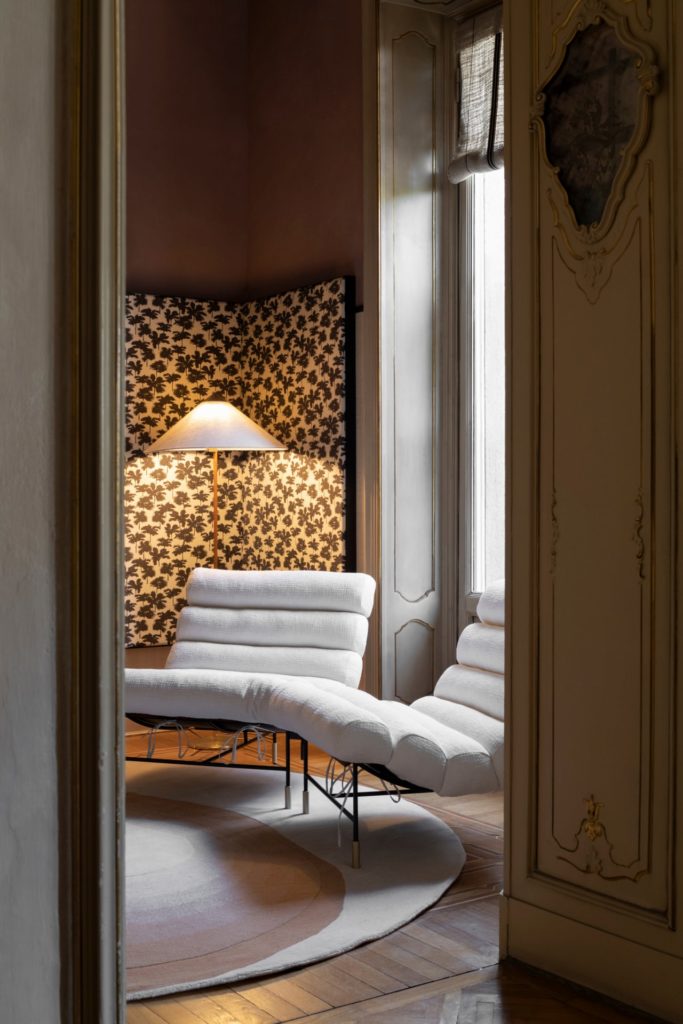
The original plan includes two bathrooms, two bedrooms, a kitchen, a living room, a dining room and two offices. “It’s Motta’s studio-office, but we also sometimes call it Spotti’s studio,” the couple explains to us. “It is in the studio that we spend the most time, with its pink ceiling and light wood desk from the Neolithic collection designed by Giuseppina for SEM, with a small reading and relaxation area. The entrance, with its round table and decorated ceilings, is very picturesque, but the studio is the corner that we love the most,” continues Claudio Spotti.
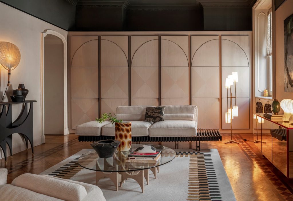
“We decided to open our house during Design Week because I have always shown SEM collections in showrooms or as installations, like in Alcova for example. This time, I wanted to give an immediate character to the design of SEM, which has a strong identity but can also speak to everyone, and adapt even to a distribution as classic as the rooms in this apartment. All the furniture was designed and created by different designers, with no common theme, but they fit well with each other and in different contexts. They are all customizable; here, we chose warmer, welcoming tones and natural materials, because the house is already quite busy with decoration. Giuseppina interpreted them remarkably well,” he continues.
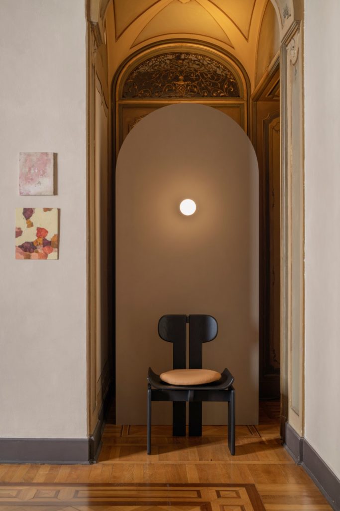
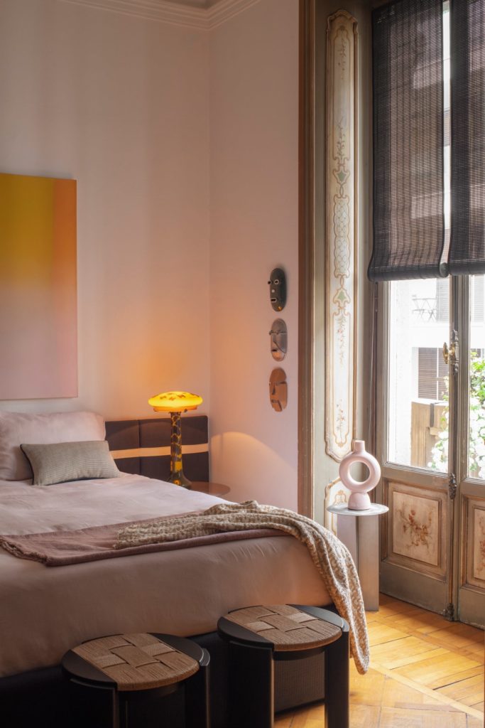
“I deliberately chose raw and organic materials throughout the house to create a warm atmosphere. The curtains are made of frayed linen, some walls are covered with straw, and then there is rope and wood,” adds Giuseppina Motta. To complete this work, there are the works of art. Giuseppina Motta and Claudio Spotti, with the support of Sara Raza, invited the A+B and Edoardo Monti galleries from Brescia to collaborate, and placed works in each of the rooms of the house. Design Week ends, but the house remains.
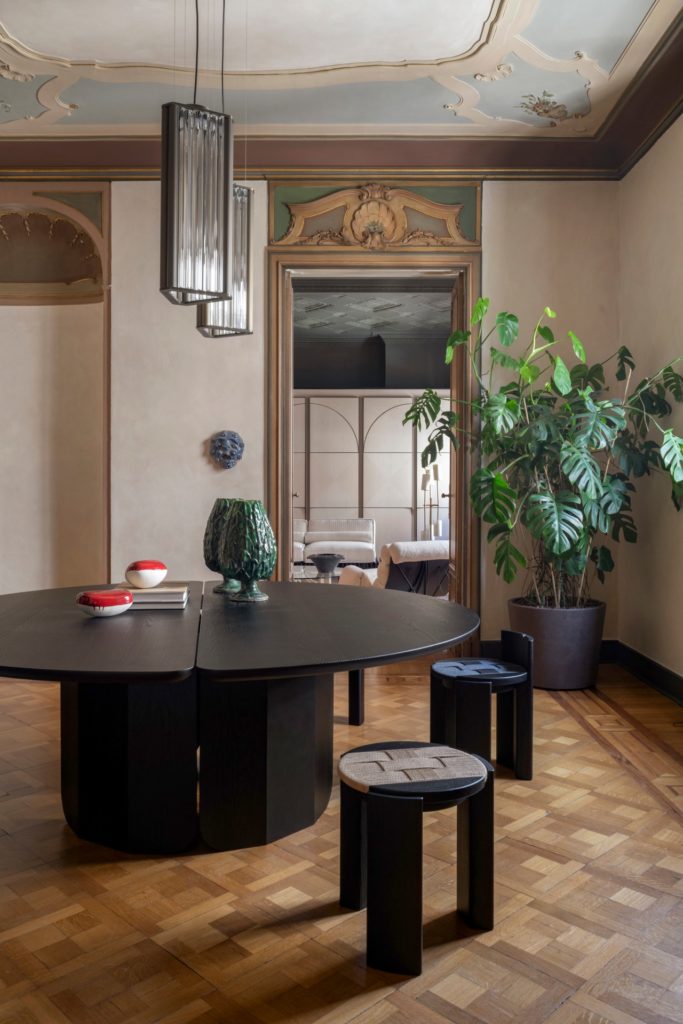
Many elements remain there, even if for professional reasons and out of passion, Giuseppina Motta and Claudio Spotti often like to “rotate” the furniture and bring new points of view to their familiar environment. What remains is, above all, a renewed interior design, reflecting their life project. Because the passion for beauty, the dialogue between heterogeneous minds and elements, and the past which merges into the future do indeed compose the ingredients of a universal recipe – a recipe which is however not given to everyone to master.
Article originally published on AD France.
